
When we think of coffee culture today, it’s hard to ignore the influence of Starbucks. With over 34,000 stores globally, Starbucks has become synonymous with premium coffee experiences. While the company’s success can be attributed to various factors like its product, customer service, and innovative marketing strategies, one cannot deny the impact of its instantly recognizable logo. In this article, we’ll take an in-depth look at the Starbucks logo history, understanding how the emblem has evolved over the years and become a cultural symbol in its own right.
The Origins of the Starbucks Logo
The Starbucks logo history began in 1971, when the company was founded by Jerry Baldwin, Zev Siegl, and Gordon Bowker in Seattle’s Pike Place Market. Their original goal was not to create the global coffeehouse brand that Starbucks is today, but to sell high-quality coffee beans and equipment. Inspired by the rich maritime heritage of Seattle, the founders wanted a logo that would reflect the seafaring history and tradition of trading coffee.
1971: The First Starbucks Logo – The Siren Appears
The original logo, created in 1971, featured a two-tailed siren or mermaid. The image was based on a 16th-century Norse woodcut of a twin-tailed siren, a figure from Greek mythology known for luring sailors with her enchanting song. In Starbucks logo history, this siren would come to symbolize the irresistible allure of Starbucks coffee, which would “lure” customers in.
The design was circular, with the words “Starbucks Coffee, Tea, Spices” surrounding the central image of the siren. The color scheme was a dark brown, giving the logo a rustic, earthy feel that reflected the brand’s humble beginnings and focus on natural, high-quality ingredients.
Why the Siren?
Many wonder why a coffee brand would choose a siren for its logo. In the context of Starbucks logo history, the siren was chosen to represent the connection between Seattle’s maritime culture and the global trade routes used to source coffee beans. Just as sailors were drawn to the siren, so too would coffee lovers be drawn to Starbucks’ exceptional product.
1987: A New Chapter, A New Logo
By 1987, Starbucks had expanded beyond just selling coffee beans and equipment. Howard Schultz, who joined Starbucks in 1982 as Director of Retail Operations and Marketing, purchased the company with a vision to transform it into a coffeehouse brand, offering brewed coffee as well as beans. With this new direction, Starbucks needed a rebrand, marking a new phase in Starbucks logo history.
The original brown logo was revamped to a more eye-catching green, symbolizing growth, freshness, and eco-friendliness, while still retaining the siren. The new logo still featured the circular shape, but the words were shortened to “Starbucks Coffee,” and the siren became more prominent. This was the first significant redesign in Starbucks logo history, and it reflected the company’s shift toward a more consumer-friendly brand.
The Color Green
Green was a deliberate choice, reflecting not only environmental consciousness but also Starbucks’ connection to agriculture and the earth. In Starbucks logo history, this was the point when the brand truly embraced its mission to be more than just a coffee company, expanding into a global brand that cared about both its product and its impact on the world.
1992: Refining the Siren
As Starbucks continued to grow and establish its presence across the United States and internationally, the logo underwent another redesign in 1992, marking another key moment in Starbucks logo history. While the green and black color scheme was retained, the siren herself was refined. Her twin tails were stylized, with a close-up of her face, making the siren the design’s focal point. The text “Starbucks Coffee” also became bolder and easier to read.
This iteration of the logo marked Starbucks’ transition from a regional player to a national and international brand. As Starbucks logo history progressed, it became a symbol of the coffeehouse experience, emphasizing comfort, quality, and community connection.
2008: Simplifying the Brand
By 2008, Starbucks faced rising competition from other coffee chains amid the challenging economic environment of the global financial crisis. To modernize its brand and streamline its image, Starbucks explored new branding strategies, including simplifying its logo.
Though the logo didn’t change immediately, the shift toward minimalism soon defined the next chapter in Starbucks’ logo history.
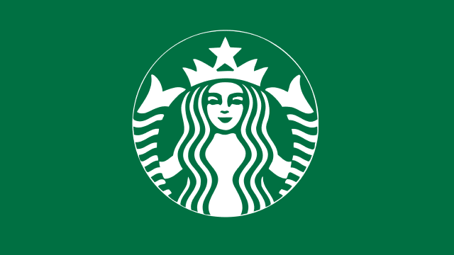
2011: The Iconic Green Siren
To mark its 40th anniversary in 2011, Starbucks unveiled a new, simplified logo. This latest logo update removed “Starbucks Coffee,” featuring only the green siren to highlight its global brand recognition. Second, Starbucks aimed to signal a future of offering more than coffee, expanding into tea, food, and lifestyle products.
The design itself also modernized the siren. She became sleeker and less detailed, reflecting a minimalist aesthetic that echoed the trends of the time. The siren’s long, flowing hair and twin tails remained, but they were streamlined to create a cleaner, more modern look.
Removing the company name from the Starbucks logo was a bold risk that could have threatened brand recognition. By this point, the iconic siren symbolized Starbucks, showcasing the strength of the brand’s visual identity.
The Minimalist Movement
The 2011 logo change marked Starbucks’ entrance into the minimalist movement in branding. Starbucks demonstrated that established brands could maintain recognition with simpler logos, leading the trend for digital and physical platforms. In Starbucks logo history, this decision is seen as a testament to the company’s brand strength.
Starbucks Logo: Symbolism and Impact
Throughout Starbucks logo history, the logo has remained centered around the siren. The siren represents mystery, allure, and the powerful draw of Starbucks coffee
As Starbucks expanded, the siren symbolized its inclusive approach, welcoming customers from all walks of life.
The green color reflects Starbucks’ commitment to sustainability and ethical sourcing. Over the years, the company has invested heavily in coffee farming communities, environmental conservation, and socially responsible business practices. The green siren logo symbolizes quality coffee and Starbucks’ global impact.
Conclusion
The Starbucks logo evolved, mirroring its growth from a Seattle coffee retailer to a global powerhouse. From its humble beginnings with a brown, rustic design to its sleek, modern green siren, each iteration of the logo tells a story about Starbucks’ journey. Keeping the siren in the logo reflects Starbucks’ commitment to its roots while adapting to customer needs. The globally recognized Starbucks logo transcends coffee culture, becoming an iconic symbol of branding.